Functions API Reference
This document contains the stand-alone plotting functions for maximum flexibility. If you want to use factory functions clustering_factory() and classifier_factory(), use the Factory API Reference instead.
This module contains a more flexible API for Scikit-plot users, exposing simple functions to generate plots.
-
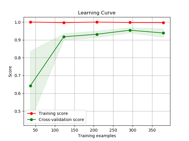
scikitplot.plotters.plot_learning_curve(clf, X, y, title='Learning Curve', cv=None, train_sizes=None, n_jobs=1, scoring=None, ax=None, figsize=None, title_fontsize='large', text_fontsize='medium')¶ DEPRECATED: This will be removed in v0.4.0. Please use scikitplot.estimators.plot_learning_curve instead.
Generates a plot of the train and test learning curves for a classifier.
- Args:
- clf: Classifier instance that implements
fitandpredict - methods.
- X (array-like, shape (n_samples, n_features)):
- Training vector, where n_samples is the number of samples and n_features is the number of features.
- y (array-like, shape (n_samples) or (n_samples, n_features)):
- Target relative to X for classification or regression; None for unsupervised learning.
- title (string, optional): Title of the generated plot. Defaults to
- “Learning Curve”
- cv (int, cross-validation generator, iterable, optional): Determines
the cross-validation strategy to be used for splitting.
- Possible inputs for cv are:
- None, to use the default 3-fold cross-validation,
- integer, to specify the number of folds.
- An object to be used as a cross-validation generator.
- An iterable yielding train/test splits.
For integer/None inputs, if
yis binary or multiclass,StratifiedKFoldused. If the estimator is not a classifier or ifyis neither binary nor multiclass,KFoldis used.- train_sizes (iterable, optional): Determines the training sizes used to
- plot the learning curve. If None,
np.linspace(.1, 1.0, 5)is used. - n_jobs (int, optional): Number of jobs to run in parallel. Defaults to
- scoring (string, callable or None, optional): default: None
- A string (see scikit-learn model evaluation documentation) or a scorerbcallable object / function with signature scorer(estimator, X, y).
- ax (
matplotlib.axes.Axes, optional): The axes upon which to - plot the curve. If None, the plot is drawn on a new set of axes.
- figsize (2-tuple, optional): Tuple denoting figure size of the plot
- e.g. (6, 6). Defaults to
None. - title_fontsize (string or int, optional): Matplotlib-style fontsizes.
- Use e.g. “small”, “medium”, “large” or integer-values. Defaults to “large”.
- text_fontsize (string or int, optional): Matplotlib-style fontsizes.
- Use e.g. “small”, “medium”, “large” or integer-values. Defaults to “medium”.
- clf: Classifier instance that implements
- Returns:
- ax (
matplotlib.axes.Axes): The axes on which the plot was - drawn.
- ax (
- Example:
>>> import scikitplot.plotters as skplt
>>> rf = RandomForestClassifier()
>>> skplt.plot_learning_curve(rf, X, y)
<matplotlib.axes._subplots.AxesSubplot object at 0x7fe967d64490>
>>> plt.show()
-
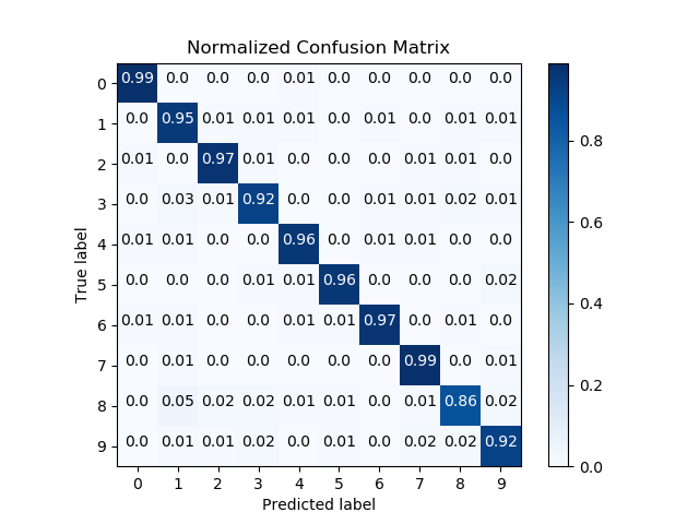
scikitplot.plotters.plot_confusion_matrix(y_true, y_pred, labels=None, true_labels=None, pred_labels=None, title=None, normalize=False, hide_zeros=False, x_tick_rotation=0, ax=None, figsize=None, cmap='Blues', title_fontsize='large', text_fontsize='medium')¶ DEPRECATED: This will be removed in v0.4.0. Please use scikitplot.metrics.plot_confusion_matrix instead.
Generates confusion matrix plot from predictions and true labels
- Args:
- y_true (array-like, shape (n_samples)):
- Ground truth (correct) target values.
- y_pred (array-like, shape (n_samples)):
- Estimated targets as returned by a classifier.
- labels (array-like, shape (n_classes), optional): List of labels to
- index the matrix. This may be used to reorder or select a subset
of labels. If none is given, those that appear at least once in
y_trueory_predare used in sorted order. (new in v0.2.5) - true_labels (array-like, optional): The true labels to display.
- If none is given, then all of the labels are used.
- pred_labels (array-like, optional): The predicted labels to display.
- If none is given, then all of the labels are used.
- title (string, optional): Title of the generated plot. Defaults to
- “Confusion Matrix” if normalize is True. Else, defaults to “Normalized Confusion Matrix.
- normalize (bool, optional): If True, normalizes the confusion matrix
- before plotting. Defaults to False.
- hide_zeros (bool, optional): If True, does not plot cells containing a
- value of zero. Defaults to False.
- x_tick_rotation (int, optional): Rotates x-axis tick labels by the
- specified angle. This is useful in cases where there are numerous categories and the labels overlap each other.
- ax (
matplotlib.axes.Axes, optional): The axes upon which to - plot the curve. If None, the plot is drawn on a new set of axes.
- figsize (2-tuple, optional): Tuple denoting figure size of the plot
- e.g. (6, 6). Defaults to
None. - cmap (string or
matplotlib.colors.Colormapinstance, optional): - Colormap used for plotting the projection. View Matplotlib Colormap documentation for available options. https://matplotlib.org/users/colormaps.html
- title_fontsize (string or int, optional): Matplotlib-style fontsizes.
- Use e.g. “small”, “medium”, “large” or integer-values. Defaults to “large”.
- text_fontsize (string or int, optional): Matplotlib-style fontsizes.
- Use e.g. “small”, “medium”, “large” or integer-values. Defaults to “medium”.
- Returns:
- ax (
matplotlib.axes.Axes): The axes on which the plot was - drawn.
- ax (
- Example:
>>> import scikitplot.plotters as skplt
>>> rf = RandomForestClassifier()
>>> rf = rf.fit(X_train, y_train)
>>> y_pred = rf.predict(X_test)
>>> skplt.plot_confusion_matrix(y_test, y_pred, normalize=True)
<matplotlib.axes._subplots.AxesSubplot object at 0x7fe967d64490>
>>> plt.show()
-
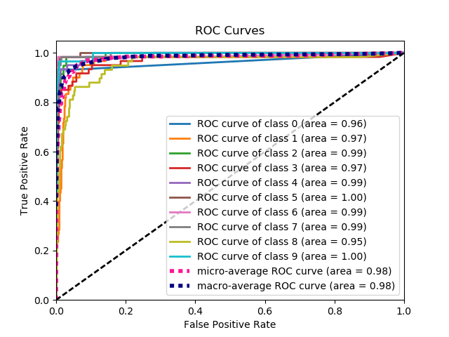
scikitplot.plotters.plot_roc_curve(y_true, y_probas, title='ROC Curves', curves=('micro', 'macro', 'each_class'), ax=None, figsize=None, cmap='nipy_spectral', title_fontsize='large', text_fontsize='medium')¶ DEPRECATED: This will be removed in v0.4.0. Please use scikitplot.metrics.plot_roc_curve instead.
Generates the ROC curves from labels and predicted scores/probabilities
- Args:
- y_true (array-like, shape (n_samples)):
- Ground truth (correct) target values.
- y_probas (array-like, shape (n_samples, n_classes)):
- Prediction probabilities for each class returned by a classifier.
- title (string, optional): Title of the generated plot. Defaults to
- “ROC Curves”.
- curves (array-like): A listing of which curves should be plotted on the
- resulting plot. Defaults to (“micro”, “macro”, “each_class”) i.e. “micro” for micro-averaged curve, “macro” for macro-averaged curve
- ax (
matplotlib.axes.Axes, optional): The axes upon which to - plot the curve. If None, the plot is drawn on a new set of axes.
- figsize (2-tuple, optional): Tuple denoting figure size of the plot
- e.g. (6, 6). Defaults to
None. - cmap (string or
matplotlib.colors.Colormapinstance, optional): - Colormap used for plotting the projection. View Matplotlib Colormap documentation for available options. https://matplotlib.org/users/colormaps.html
- title_fontsize (string or int, optional): Matplotlib-style fontsizes.
- Use e.g. “small”, “medium”, “large” or integer-values. Defaults to “large”.
- text_fontsize (string or int, optional): Matplotlib-style fontsizes.
- Use e.g. “small”, “medium”, “large” or integer-values. Defaults to “medium”.
- Returns:
- ax (
matplotlib.axes.Axes): The axes on which the plot was - drawn.
- ax (
- Example:
>>> import scikitplot.plotters as skplt
>>> nb = GaussianNB()
>>> nb = nb.fit(X_train, y_train)
>>> y_probas = nb.predict_proba(X_test)
>>> skplt.plot_roc_curve(y_test, y_probas)
<matplotlib.axes._subplots.AxesSubplot object at 0x7fe967d64490>
>>> plt.show()
-
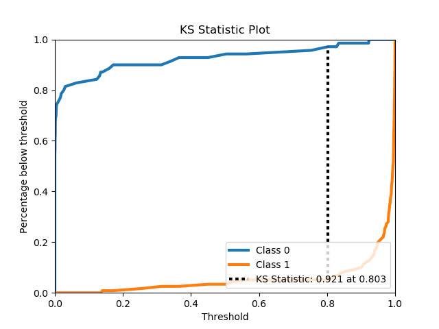
scikitplot.plotters.plot_ks_statistic(y_true, y_probas, title='KS Statistic Plot', ax=None, figsize=None, title_fontsize='large', text_fontsize='medium')¶ DEPRECATED: This will be removed in v0.4.0. Please use scikitplot.metrics.plot_ks_statistic instead.
Generates the KS Statistic plot from labels and scores/probabilities
- Args:
- y_true (array-like, shape (n_samples)):
- Ground truth (correct) target values.
- y_probas (array-like, shape (n_samples, n_classes)):
- Prediction probabilities for each class returned by a classifier.
- title (string, optional): Title of the generated plot. Defaults to
- “KS Statistic Plot”.
- ax (
matplotlib.axes.Axes, optional): The axes upon which to - plot the learning curve. If None, the plot is drawn on a new set of axes.
- figsize (2-tuple, optional): Tuple denoting figure size of the plot
- e.g. (6, 6). Defaults to
None. - title_fontsize (string or int, optional): Matplotlib-style fontsizes.
- Use e.g. “small”, “medium”, “large” or integer-values. Defaults to “large”.
- text_fontsize (string or int, optional): Matplotlib-style fontsizes.
- Use e.g. “small”, “medium”, “large” or integer-values. Defaults to “medium”.
- Returns:
- ax (
matplotlib.axes.Axes): The axes on which the plot was - drawn.
- ax (
- Example:
>>> import scikitplot.plotters as skplt
>>> lr = LogisticRegression()
>>> lr = lr.fit(X_train, y_train)
>>> y_probas = lr.predict_proba(X_test)
>>> skplt.plot_ks_statistic(y_test, y_probas)
<matplotlib.axes._subplots.AxesSubplot object at 0x7fe967d64490>
>>> plt.show()
-
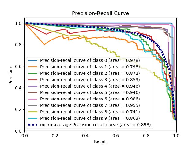
scikitplot.plotters.plot_precision_recall_curve(y_true, y_probas, title='Precision-Recall Curve', curves=('micro', 'each_class'), ax=None, figsize=None, cmap='nipy_spectral', title_fontsize='large', text_fontsize='medium')¶ DEPRECATED: This will be removed in v0.4.0. Please use scikitplot.metrics.plot_precision_recall_curve instead.
Generates the Precision Recall Curve from labels and probabilities
- Args:
- y_true (array-like, shape (n_samples)):
- Ground truth (correct) target values.
- y_probas (array-like, shape (n_samples, n_classes)):
- Prediction probabilities for each class returned by a classifier.
- curves (array-like): A listing of which curves should be plotted on the
- resulting plot. Defaults to (“micro”, “each_class”) i.e. “micro” for micro-averaged curve
- ax (
matplotlib.axes.Axes, optional): The axes upon which to - plot the curve. If None, the plot is drawn on a new set of axes.
- figsize (2-tuple, optional): Tuple denoting figure size of the plot
- e.g. (6, 6). Defaults to
None. - cmap (string or
matplotlib.colors.Colormapinstance, optional): - Colormap used for plotting the projection. View Matplotlib Colormap documentation for available options. https://matplotlib.org/users/colormaps.html
- title_fontsize (string or int, optional): Matplotlib-style fontsizes.
- Use e.g. “small”, “medium”, “large” or integer-values. Defaults to “large”.
- text_fontsize (string or int, optional): Matplotlib-style fontsizes.
- Use e.g. “small”, “medium”, “large” or integer-values. Defaults to “medium”.
- Returns:
- ax (
matplotlib.axes.Axes): The axes on which the plot was - drawn.
- ax (
- Example:
>>> import scikitplot.plotters as skplt
>>> nb = GaussianNB()
>>> nb = nb.fit(X_train, y_train)
>>> y_probas = nb.predict_proba(X_test)
>>> skplt.plot_precision_recall_curve(y_test, y_probas)
<matplotlib.axes._subplots.AxesSubplot object at 0x7fe967d64490>
>>> plt.show()
-
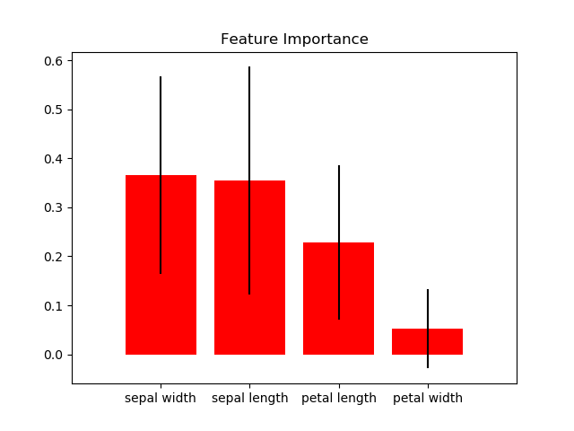
scikitplot.plotters.plot_feature_importances(clf, title='Feature Importance', feature_names=None, max_num_features=20, order='descending', x_tick_rotation=0, ax=None, figsize=None, title_fontsize='large', text_fontsize='medium')¶ DEPRECATED: This will be removed in v0.4.0. Please use scikitplot.estimators.plot_feature_importances instead.
Generates a plot of a classifier’s feature importances.
- Args:
- clf: Classifier instance that implements
fitandpredict_proba - methods. The classifier must also have a
feature_importances_attribute. - title (string, optional): Title of the generated plot. Defaults to
- “Feature importances”.
- feature_names (None,
listof string, optional): Determines the - feature names used to plot the feature importances. If None, feature names will be numbered.
- max_num_features (int): Determines the maximum number of features to
- plot. Defaults to 20.
- order (‘ascending’, ‘descending’, or None, optional): Determines the
- order in which the feature importances are plotted. Defaults to ‘descending’.
- x_tick_rotation (int, optional): Rotates x-axis tick labels by the
- specified angle. This is useful in cases where there are numerous categories and the labels overlap each other.
- ax (
matplotlib.axes.Axes, optional): The axes upon which to - plot the curve. If None, the plot is drawn on a new set of axes.
- figsize (2-tuple, optional): Tuple denoting figure size of the plot
- e.g. (6, 6). Defaults to
None. - title_fontsize (string or int, optional): Matplotlib-style fontsizes.
- Use e.g. “small”, “medium”, “large” or integer-values. Defaults to “large”.
- text_fontsize (string or int, optional): Matplotlib-style fontsizes.
- Use e.g. “small”, “medium”, “large” or integer-values. Defaults to “medium”.
- clf: Classifier instance that implements
- Returns:
- ax (
matplotlib.axes.Axes): The axes on which the plot was - drawn.
- ax (
- Example:
>>> import scikitplot.plotters as skplt
>>> rf = RandomForestClassifier()
>>> rf.fit(X, y)
>>> skplt.plot_feature_importances(
...     rf, feature_names=['petal length', 'petal width',
...                        'sepal length', 'sepal width'])
<matplotlib.axes._subplots.AxesSubplot object at 0x7fe967d64490>
>>> plt.show()
-
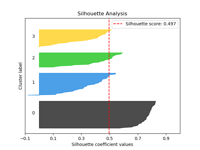
scikitplot.plotters.plot_silhouette(clf, X, title='Silhouette Analysis', metric='euclidean', copy=True, ax=None, figsize=None, cmap='nipy_spectral', title_fontsize='large', text_fontsize='medium')¶ DEPRECATED: This will be removed in v0.4.0. Please use scikitplot.metrics.plot_silhouette instead.
Plots silhouette analysis of clusters using fit_predict.
- Args:
- clf: Clusterer instance that implements
fitandfit_predict - methods.
- X (array-like, shape (n_samples, n_features)):
- Data to cluster, where n_samples is the number of samples and n_features is the number of features.
- title (string, optional): Title of the generated plot. Defaults to
- “Silhouette Analysis”
- metric (string or callable, optional): The metric to use when
- calculating distance between instances in a feature array. If metric is a string, it must be one of the options allowed by sklearn.metrics.pairwise.pairwise_distances. If X is the distance array itself, use “precomputed” as the metric.
- copy (boolean, optional): Determines whether
fitis used on - clf or on a copy of clf.
- ax (
matplotlib.axes.Axes, optional): The axes upon which to - plot the curve. If None, the plot is drawn on a new set of axes.
- figsize (2-tuple, optional): Tuple denoting figure size of the plot
- e.g. (6, 6). Defaults to
None. - cmap (string or
matplotlib.colors.Colormapinstance, optional): - Colormap used for plotting the projection. View Matplotlib Colormap documentation for available options. https://matplotlib.org/users/colormaps.html
- title_fontsize (string or int, optional): Matplotlib-style fontsizes.
- Use e.g. “small”, “medium”, “large” or integer-values. Defaults to “large”.
- text_fontsize (string or int, optional): Matplotlib-style fontsizes.
- Use e.g. “small”, “medium”, “large” or integer-values. Defaults to “medium”.
- clf: Clusterer instance that implements
- Returns:
- ax (
matplotlib.axes.Axes): The axes on which the plot was - drawn.
- ax (
- Example:
>>> import scikitplot.plotters as skplt
>>> kmeans = KMeans(n_clusters=4, random_state=1)
>>> skplt.plot_silhouette(kmeans, X)
<matplotlib.axes._subplots.AxesSubplot object at 0x7fe967d64490>
>>> plt.show()
-
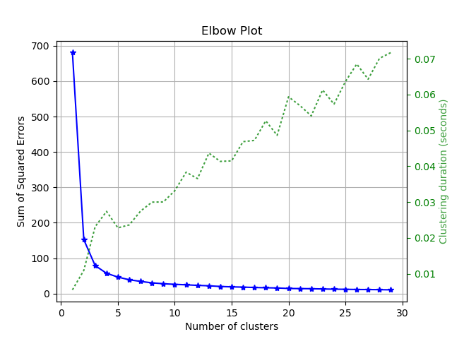
scikitplot.plotters.plot_elbow_curve(clf, X, title='Elbow Plot', cluster_ranges=None, ax=None, figsize=None, title_fontsize='large', text_fontsize='medium')¶ DEPRECATED: This will be removed in v0.4.0. Please use scikitplot.cluster.plot_elbow_curve instead.
Plots elbow curve of different values of K for KMeans clustering.
- Args:
- clf: Clusterer instance that implements
fitandfit_predict - methods and a
scoreparameter. - X (array-like, shape (n_samples, n_features)):
- Data to cluster, where n_samples is the number of samples and n_features is the number of features.
- title (string, optional): Title of the generated plot. Defaults to
- “Elbow Plot”
- cluster_ranges (None or
listof int, optional): List of - n_clusters for which to plot the explained variances. Defaults to
range(1, 12, 2). - copy (boolean, optional): Determines whether
fitis used on - clf or on a copy of clf.
- ax (
matplotlib.axes.Axes, optional): The axes upon which to - plot the curve. If None, the plot is drawn on a new set of axes.
- figsize (2-tuple, optional): Tuple denoting figure size of the plot
- e.g. (6, 6). Defaults to
None. - title_fontsize (string or int, optional): Matplotlib-style fontsizes.
- Use e.g. “small”, “medium”, “large” or integer-values. Defaults to “large”.
- text_fontsize (string or int, optional): Matplotlib-style fontsizes.
- Use e.g. “small”, “medium”, “large” or integer-values. Defaults to “medium”.
- clf: Clusterer instance that implements
- Returns:
- ax (
matplotlib.axes.Axes): The axes on which the plot was - drawn.
- ax (
- Example:
>>> import scikitplot.plotters as skplt
>>> kmeans = KMeans(random_state=1)
>>> skplt.plot_elbow_curve(kmeans, cluster_ranges=range(1, 11))
<matplotlib.axes._subplots.AxesSubplot object at 0x7fe967d64490>
>>> plt.show()
-
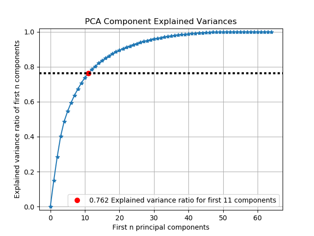
scikitplot.plotters.plot_pca_component_variance(clf, title='PCA Component Explained Variances', target_explained_variance=0.75, ax=None, figsize=None, title_fontsize='large', text_fontsize='medium')¶ DEPRECATED: This will be removed in v0.4.0. Please use scikitplot.decomposition.plot_pca_component_variance instead.
Plots PCA components’ explained variance ratios. (new in v0.2.2)
- Args:
clf: PCA instance that has the
explained_variance_ratio_attribute.- title (string, optional): Title of the generated plot. Defaults to
- “PCA Component Explained Variances”
- target_explained_variance (float, optional): Looks for the minimum
- number of principal components that satisfies this value and emphasizes it on the plot. Defaults to 0.75
- ax (
matplotlib.axes.Axes, optional): The axes upon which to - plot the curve. If None, the plot is drawn on a new set of axes.
- figsize (2-tuple, optional): Tuple denoting figure size of the plot
- e.g. (6, 6). Defaults to
None. - title_fontsize (string or int, optional): Matplotlib-style fontsizes.
- Use e.g. “small”, “medium”, “large” or integer-values. Defaults to “large”.
- text_fontsize (string or int, optional): Matplotlib-style fontsizes.
- Use e.g. “small”, “medium”, “large” or integer-values. Defaults to “medium”.
- Returns:
- ax (
matplotlib.axes.Axes): The axes on which the plot was - drawn.
- ax (
- Example:
>>> import scikitplot.plotters as skplt
>>> pca = PCA(random_state=1)
>>> pca.fit(X)
>>> skplt.plot_pca_component_variance(pca)
<matplotlib.axes._subplots.AxesSubplot object at 0x7fe967d64490>
>>> plt.show()
-
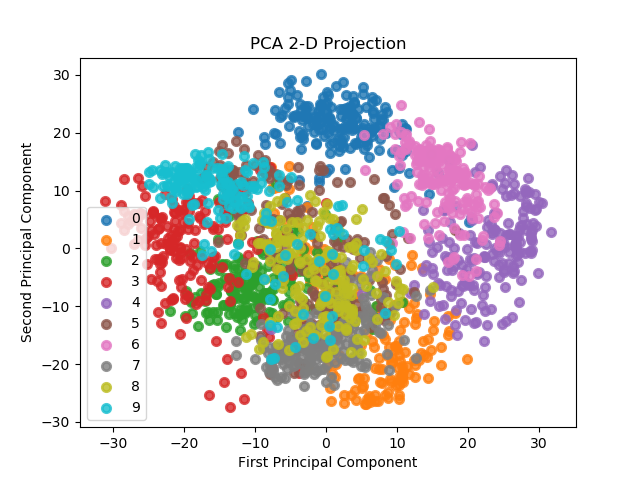
scikitplot.plotters.plot_pca_2d_projection(clf, X, y, title='PCA 2-D Projection', ax=None, figsize=None, cmap='Spectral', title_fontsize='large', text_fontsize='medium')¶ DEPRECATED: This will be removed in v0.4.0. Please use scikitplot.decomposition.plot_pca_component_variance instead.
Plots the 2-dimensional projection of PCA on a given dataset.
- Args:
- clf: Fitted PCA instance that can
transformgiven data set into 2 - dimensions.
- X (array-like, shape (n_samples, n_features)):
- Feature set to project, where n_samples is the number of samples and n_features is the number of features.
- y (array-like, shape (n_samples) or (n_samples, n_features)):
- Target relative to X for labeling.
- title (string, optional): Title of the generated plot. Defaults to
- “PCA 2-D Projection”
- ax (
matplotlib.axes.Axes, optional): The axes upon which to - plot the curve. If None, the plot is drawn on a new set of axes.
- figsize (2-tuple, optional): Tuple denoting figure size of the plot
- e.g. (6, 6). Defaults to
None. - cmap (string or
matplotlib.colors.Colormapinstance, optional): - Colormap used for plotting the projection. View Matplotlib Colormap documentation for available options. https://matplotlib.org/users/colormaps.html
- title_fontsize (string or int, optional): Matplotlib-style fontsizes.
- Use e.g. “small”, “medium”, “large” or integer-values. Defaults to “large”.
- text_fontsize (string or int, optional): Matplotlib-style fontsizes.
- Use e.g. “small”, “medium”, “large” or integer-values. Defaults to “medium”.
- clf: Fitted PCA instance that can
- Returns:
- ax (
matplotlib.axes.Axes): The axes on which the plot was - drawn.
- ax (
- Example:
>>> import scikitplot.plotters as skplt
>>> pca = PCA(random_state=1)
>>> pca.fit(X)
>>> skplt.plot_pca_2d_projection(pca, X, y)
<matplotlib.axes._subplots.AxesSubplot object at 0x7fe967d64490>
>>> plt.show()