Metrics Module (API Reference)
The scikitplot.metrics module includes plots for machine learning
evaluation metrics e.g. confusion matrix, silhouette scores, etc.
-
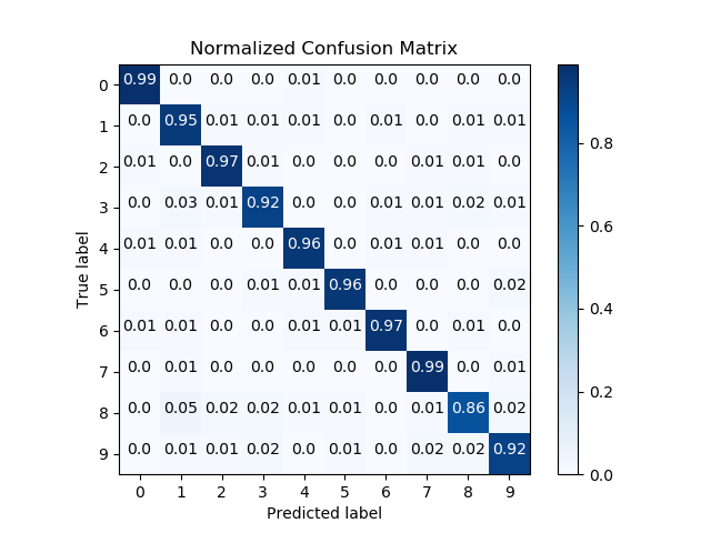
scikitplot.metrics.plot_confusion_matrix(y_true, y_pred, labels=None, true_labels=None, pred_labels=None, title=None, normalize=False, hide_zeros=False, hide_counts=False, x_tick_rotation=0, ax=None, figsize=None, cmap='Blues', title_fontsize='large', text_fontsize='medium')¶ Generates confusion matrix plot from predictions and true labels
Parameters: - y_true (array-like, shape (n_samples)) – Ground truth (correct) target values.
- y_pred (array-like, shape (n_samples)) – Estimated targets as returned by a classifier.
- labels (array-like, shape (n_classes), optional) – List of labels to
index the matrix. This may be used to reorder or select a subset
of labels. If none is given, those that appear at least once in
y_trueory_predare used in sorted order. (new in v0.2.5) - true_labels (array-like, optional) – The true labels to display. If none is given, then all of the labels are used.
- pred_labels (array-like, optional) – The predicted labels to display. If none is given, then all of the labels are used.
- title (string, optional) – Title of the generated plot. Defaults to “Confusion Matrix” if normalize is True. Else, defaults to “Normalized Confusion Matrix.
- normalize (bool, optional) – If True, normalizes the confusion matrix before plotting. Defaults to False.
- hide_zeros (bool, optional) – If True, does not plot cells containing a value of zero. Defaults to False.
- hide_counts (bool, optional) – If True, doe not overlay counts. Defaults to False.
- x_tick_rotation (int, optional) – Rotates x-axis tick labels by the specified angle. This is useful in cases where there are numerous categories and the labels overlap each other.
- ax (
matplotlib.axes.Axes, optional) – The axes upon which to plot the curve. If None, the plot is drawn on a new set of axes. - figsize (2-tuple, optional) – Tuple denoting figure size of the plot
e.g. (6, 6). Defaults to
None. - cmap (string or
matplotlib.colors.Colormapinstance, optional) – Colormap used for plotting the projection. View Matplotlib Colormap documentation for available options. https://matplotlib.org/users/colormaps.html - title_fontsize (string or int, optional) – Matplotlib-style fontsizes. Use e.g. “small”, “medium”, “large” or integer-values. Defaults to “large”.
- text_fontsize (string or int, optional) – Matplotlib-style fontsizes. Use e.g. “small”, “medium”, “large” or integer-values. Defaults to “medium”.
Returns: - The axes on which the plot was
drawn.
Return type: ax (
matplotlib.axes.Axes)Example
>>> import scikitplot as skplt
>>> rf = RandomForestClassifier()
>>> rf = rf.fit(X_train, y_train)
>>> y_pred = rf.predict(X_test)
>>> skplt.metrics.plot_confusion_matrix(y_test, y_pred, normalize=True)
<matplotlib.axes._subplots.AxesSubplot object at 0x7fe967d64490>
>>> plt.show()
-
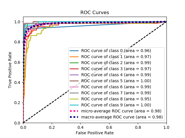
scikitplot.metrics.plot_roc(y_true, y_probas, title='ROC Curves', plot_micro=True, plot_macro=True, classes_to_plot=None, ax=None, figsize=None, cmap='nipy_spectral', title_fontsize='large', text_fontsize='medium')¶ Generates the ROC curves from labels and predicted scores/probabilities
Parameters: - y_true (array-like, shape (n_samples)) – Ground truth (correct) target values.
- y_probas (array-like, shape (n_samples, n_classes)) – Prediction probabilities for each class returned by a classifier.
- title (string, optional) – Title of the generated plot. Defaults to “ROC Curves”.
- plot_micro (boolean, optional) – Plot the micro average ROC curve.
Defaults to
True. - plot_macro (boolean, optional) – Plot the macro average ROC curve.
Defaults to
True. - classes_to_plot (list-like, optional) – Classes for which the ROC
curve should be plotted. e.g. [0, ‘cold’]. If given class does not exist,
it will be ignored. If
None, all classes will be plotted. Defaults toNone - ax (
matplotlib.axes.Axes, optional) – The axes upon which to plot the curve. If None, the plot is drawn on a new set of axes. - figsize (2-tuple, optional) – Tuple denoting figure size of the plot
e.g. (6, 6). Defaults to
None. - cmap (string or
matplotlib.colors.Colormapinstance, optional) – Colormap used for plotting the projection. View Matplotlib Colormap documentation for available options. https://matplotlib.org/users/colormaps.html - title_fontsize (string or int, optional) – Matplotlib-style fontsizes. Use e.g. “small”, “medium”, “large” or integer-values. Defaults to “large”.
- text_fontsize (string or int, optional) – Matplotlib-style fontsizes. Use e.g. “small”, “medium”, “large” or integer-values. Defaults to “medium”.
Returns: - The axes on which the plot was
drawn.
Return type: ax (
matplotlib.axes.Axes)Example
>>> import scikitplot as skplt
>>> nb = GaussianNB()
>>> nb = nb.fit(X_train, y_train)
>>> y_probas = nb.predict_proba(X_test)
>>> skplt.metrics.plot_roc(y_test, y_probas)
<matplotlib.axes._subplots.AxesSubplot object at 0x7fe967d64490>
>>> plt.show()
-
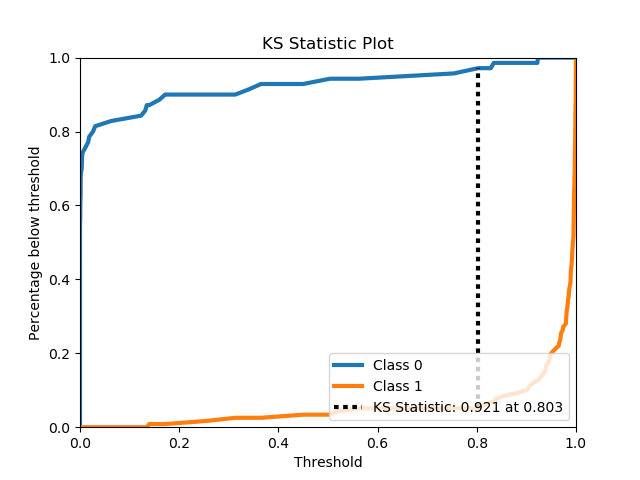
scikitplot.metrics.plot_ks_statistic(y_true, y_probas, title='KS Statistic Plot', ax=None, figsize=None, title_fontsize='large', text_fontsize='medium')¶ Generates the KS Statistic plot from labels and scores/probabilities
Parameters: - y_true (array-like, shape (n_samples)) – Ground truth (correct) target values.
- y_probas (array-like, shape (n_samples, n_classes)) – Prediction probabilities for each class returned by a classifier.
- title (string, optional) – Title of the generated plot. Defaults to “KS Statistic Plot”.
- ax (
matplotlib.axes.Axes, optional) – The axes upon which to plot the learning curve. If None, the plot is drawn on a new set of axes. - figsize (2-tuple, optional) – Tuple denoting figure size of the plot
e.g. (6, 6). Defaults to
None. - title_fontsize (string or int, optional) – Matplotlib-style fontsizes. Use e.g. “small”, “medium”, “large” or integer-values. Defaults to “large”.
- text_fontsize (string or int, optional) – Matplotlib-style fontsizes. Use e.g. “small”, “medium”, “large” or integer-values. Defaults to “medium”.
Returns: - The axes on which the plot was
drawn.
Return type: ax (
matplotlib.axes.Axes)Example
>>> import scikitplot as skplt
>>> lr = LogisticRegression()
>>> lr = lr.fit(X_train, y_train)
>>> y_probas = lr.predict_proba(X_test)
>>> skplt.metrics.plot_ks_statistic(y_test, y_probas)
<matplotlib.axes._subplots.AxesSubplot object at 0x7fe967d64490>
>>> plt.show()
-
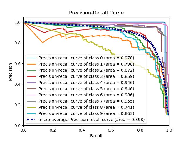
scikitplot.metrics.plot_precision_recall(y_true, y_probas, title='Precision-Recall Curve', plot_micro=True, classes_to_plot=None, ax=None, figsize=None, cmap='nipy_spectral', title_fontsize='large', text_fontsize='medium')¶ Generates the Precision Recall Curve from labels and probabilities
Parameters: - y_true (array-like, shape (n_samples)) – Ground truth (correct) target values.
- y_probas (array-like, shape (n_samples, n_classes)) – Prediction probabilities for each class returned by a classifier.
- title (string, optional) – Title of the generated plot. Defaults to “Precision-Recall curve”.
- plot_micro (boolean, optional) – Plot the micro average ROC curve.
Defaults to
True. - classes_to_plot (list-like, optional) – Classes for which the precision-recall
curve should be plotted. e.g. [0, ‘cold’]. If given class does not exist,
it will be ignored. If
None, all classes will be plotted. Defaults toNone. - ax (
matplotlib.axes.Axes, optional) – The axes upon which to plot the curve. If None, the plot is drawn on a new set of axes. - figsize (2-tuple, optional) – Tuple denoting figure size of the plot
e.g. (6, 6). Defaults to
None. - cmap (string or
matplotlib.colors.Colormapinstance, optional) – Colormap used for plotting the projection. View Matplotlib Colormap documentation for available options. https://matplotlib.org/users/colormaps.html - title_fontsize (string or int, optional) – Matplotlib-style fontsizes. Use e.g. “small”, “medium”, “large” or integer-values. Defaults to “large”.
- text_fontsize (string or int, optional) – Matplotlib-style fontsizes. Use e.g. “small”, “medium”, “large” or integer-values. Defaults to “medium”.
Returns: - The axes on which the plot was
drawn.
Return type: ax (
matplotlib.axes.Axes)Example
>>> import scikitplot as skplt
>>> nb = GaussianNB()
>>> nb.fit(X_train, y_train)
>>> y_probas = nb.predict_proba(X_test)
>>> skplt.metrics.plot_precision_recall(y_test, y_probas)
<matplotlib.axes._subplots.AxesSubplot object at 0x7fe967d64490>
>>> plt.show()
-
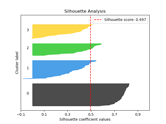
scikitplot.metrics.plot_silhouette(X, cluster_labels, title='Silhouette Analysis', metric='euclidean', copy=True, ax=None, figsize=None, cmap='nipy_spectral', title_fontsize='large', text_fontsize='medium')¶ Plots silhouette analysis of clusters provided.
Parameters: - X (array-like, shape (n_samples, n_features)) – Data to cluster, where n_samples is the number of samples and n_features is the number of features.
- cluster_labels (array-like, shape (n_samples,)) – Cluster label for each sample.
- title (string, optional) – Title of the generated plot. Defaults to “Silhouette Analysis”
- metric (string or callable, optional) – The metric to use when calculating distance between instances in a feature array. If metric is a string, it must be one of the options allowed by sklearn.metrics.pairwise.pairwise_distances. If X is the distance array itself, use “precomputed” as the metric.
- copy (boolean, optional) – Determines whether
fitis used on clf or on a copy of clf. - ax (
matplotlib.axes.Axes, optional) – The axes upon which to plot the curve. If None, the plot is drawn on a new set of axes. - figsize (2-tuple, optional) – Tuple denoting figure size of the plot
e.g. (6, 6). Defaults to
None. - cmap (string or
matplotlib.colors.Colormapinstance, optional) – Colormap used for plotting the projection. View Matplotlib Colormap documentation for available options. https://matplotlib.org/users/colormaps.html - title_fontsize (string or int, optional) – Matplotlib-style fontsizes. Use e.g. “small”, “medium”, “large” or integer-values. Defaults to “large”.
- text_fontsize (string or int, optional) – Matplotlib-style fontsizes. Use e.g. “small”, “medium”, “large” or integer-values. Defaults to “medium”.
Returns: - The axes on which the plot was
drawn.
Return type: ax (
matplotlib.axes.Axes)Example
>>> import scikitplot as skplt
>>> kmeans = KMeans(n_clusters=4, random_state=1)
>>> cluster_labels = kmeans.fit_predict(X)
>>> skplt.metrics.plot_silhouette(X, cluster_labels)
<matplotlib.axes._subplots.AxesSubplot object at 0x7fe967d64490>
>>> plt.show()
-
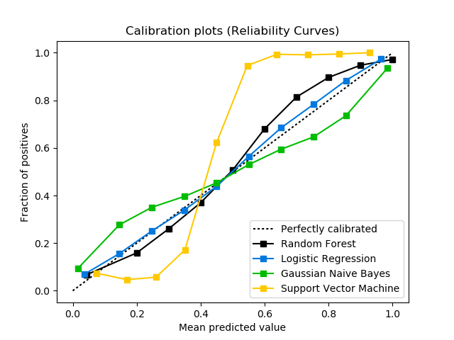
scikitplot.metrics.plot_calibration_curve(y_true, probas_list, clf_names=None, n_bins=10, title='Calibration plots (Reliability Curves)', ax=None, figsize=None, cmap='nipy_spectral', title_fontsize='large', text_fontsize='medium')¶ Plots calibration curves for a set of classifier probability estimates.
Plotting the calibration curves of a classifier is useful for determining whether or not you can interpret their predicted probabilities directly as as confidence level. For instance, a well-calibrated binary classifier should classify the samples such that for samples to which it gave a score of 0.8, around 80% should actually be from the positive class.
This function currently only works for binary classification.
Parameters: - y_true (array-like, shape (n_samples)) – Ground truth (correct) target values.
- probas_list (list of array-like, shape (n_samples, 2) or (n_samples,)) – A list containing the outputs of binary classifiers’
predict_proba()method ordecision_function()method. - clf_names (list of str, optional) – A list of strings, where each string
refers to the name of the classifier that produced the
corresponding probability estimates in probas_list. If
None, the names “Classifier 1”, “Classifier 2”, etc. will be used. - n_bins (int, optional) – Number of bins. A bigger number requires more data.
- title (string, optional) – Title of the generated plot. Defaults to “Calibration plots (Reliabilirt Curves)”
- ax (
matplotlib.axes.Axes, optional) – The axes upon which to plot the curve. If None, the plot is drawn on a new set of axes. - figsize (2-tuple, optional) – Tuple denoting figure size of the plot
e.g. (6, 6). Defaults to
None. - cmap (string or
matplotlib.colors.Colormapinstance, optional) – Colormap used for plotting the projection. View Matplotlib Colormap documentation for available options. https://matplotlib.org/users/colormaps.html - title_fontsize (string or int, optional) – Matplotlib-style fontsizes. Use e.g. “small”, “medium”, “large” or integer-values. Defaults to “large”.
- text_fontsize (string or int, optional) – Matplotlib-style fontsizes. Use e.g. “small”, “medium”, “large” or integer-values. Defaults to “medium”.
Returns: The axes on which the plot was drawn.
Return type: matplotlib.axes.AxesExample
>>> import scikitplot as skplt
>>> rf = RandomForestClassifier()
>>> lr = LogisticRegression()
>>> nb = GaussianNB()
>>> svm = LinearSVC()
>>> rf_probas = rf.fit(X_train, y_train).predict_proba(X_test)
>>> lr_probas = lr.fit(X_train, y_train).predict_proba(X_test)
>>> nb_probas = nb.fit(X_train, y_train).predict_proba(X_test)
>>> svm_scores = svm.fit(X_train, y_train).decision_function(X_test)
>>> probas_list = [rf_probas, lr_probas, nb_probas, svm_scores]
>>> clf_names = ['Random Forest', 'Logistic Regression',
...              'Gaussian Naive Bayes', 'Support Vector Machine']
>>> skplt.metrics.plot_calibration_curve(y_test,
...                                      probas_list,
...                                      clf_names)
<matplotlib.axes._subplots.AxesSubplot object at 0x7fe967d64490>
>>> plt.show()
-
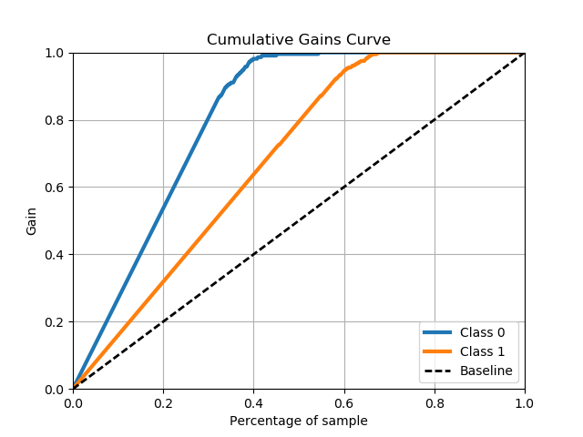
scikitplot.metrics.plot_cumulative_gain(y_true, y_probas, title='Cumulative Gains Curve', ax=None, figsize=None, title_fontsize='large', text_fontsize='medium')¶ Generates the Cumulative Gains Plot from labels and scores/probabilities
The cumulative gains chart is used to determine the effectiveness of a binary classifier. A detailed explanation can be found at http://mlwiki.org/index.php/Cumulative_Gain_Chart. The implementation here works only for binary classification.
Parameters: - y_true (array-like, shape (n_samples)) – Ground truth (correct) target values.
- y_probas (array-like, shape (n_samples, n_classes)) – Prediction probabilities for each class returned by a classifier.
- title (string, optional) – Title of the generated plot. Defaults to “Cumulative Gains Curve”.
- ax (
matplotlib.axes.Axes, optional) – The axes upon which to plot the learning curve. If None, the plot is drawn on a new set of axes. - figsize (2-tuple, optional) – Tuple denoting figure size of the plot
e.g. (6, 6). Defaults to
None. - title_fontsize (string or int, optional) – Matplotlib-style fontsizes. Use e.g. “small”, “medium”, “large” or integer-values. Defaults to “large”.
- text_fontsize (string or int, optional) – Matplotlib-style fontsizes. Use e.g. “small”, “medium”, “large” or integer-values. Defaults to “medium”.
Returns: - The axes on which the plot was
drawn.
Return type: ax (
matplotlib.axes.Axes)Example
>>> import scikitplot as skplt
>>> lr = LogisticRegression()
>>> lr = lr.fit(X_train, y_train)
>>> y_probas = lr.predict_proba(X_test)
>>> skplt.metrics.plot_cumulative_gain(y_test, y_probas)
<matplotlib.axes._subplots.AxesSubplot object at 0x7fe967d64490>
>>> plt.show()
-
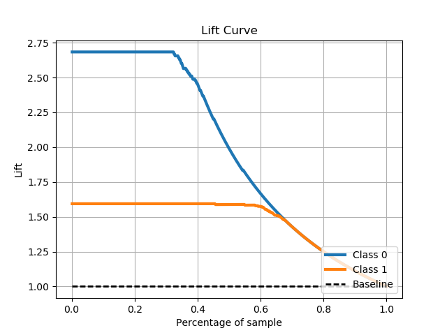
scikitplot.metrics.plot_lift_curve(y_true, y_probas, title='Lift Curve', ax=None, figsize=None, title_fontsize='large', text_fontsize='medium')¶ Generates the Lift Curve from labels and scores/probabilities
The lift curve is used to determine the effectiveness of a binary classifier. A detailed explanation can be found at http://www2.cs.uregina.ca/~dbd/cs831/notes/lift_chart/lift_chart.html. The implementation here works only for binary classification.
Parameters: - y_true (array-like, shape (n_samples)) – Ground truth (correct) target values.
- y_probas (array-like, shape (n_samples, n_classes)) – Prediction probabilities for each class returned by a classifier.
- title (string, optional) – Title of the generated plot. Defaults to “Lift Curve”.
- ax (
matplotlib.axes.Axes, optional) – The axes upon which to plot the learning curve. If None, the plot is drawn on a new set of axes. - figsize (2-tuple, optional) – Tuple denoting figure size of the plot
e.g. (6, 6). Defaults to
None. - title_fontsize (string or int, optional) – Matplotlib-style fontsizes. Use e.g. “small”, “medium”, “large” or integer-values. Defaults to “large”.
- text_fontsize (string or int, optional) – Matplotlib-style fontsizes. Use e.g. “small”, “medium”, “large” or integer-values. Defaults to “medium”.
Returns: - The axes on which the plot was
drawn.
Return type: ax (
matplotlib.axes.Axes)Example
>>> import scikitplot as skplt
>>> lr = LogisticRegression()
>>> lr = lr.fit(X_train, y_train)
>>> y_probas = lr.predict_proba(X_test)
>>> skplt.metrics.plot_lift_curve(y_test, y_probas)
<matplotlib.axes._subplots.AxesSubplot object at 0x7fe967d64490>
>>> plt.show()