Welcome to Scikit-plot’s documentation!
The quickest and easiest way to go from analysis…

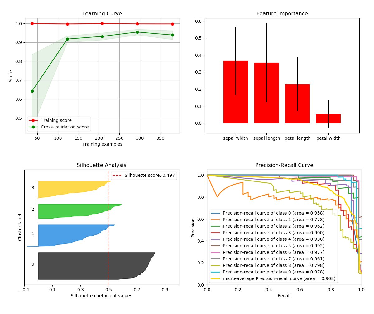
…to this.
Scikit-plot is the result of an unartistic data scientist’s dreadful realization that visualization is one of the most crucial components in the data science process, not just a mere afterthought.
Gaining insights is simply a lot easier when you’re looking at a colored heatmap of a confusion matrix complete with class labels rather than a single-line dump of numbers enclosed in brackets. Besides, if you ever need to present your results to someone (virtually any time anybody hires you to do data science), you show them visualizations, not a bunch of numbers in Excel.
That said, there are a number of visualizations that frequently pop up in machine learning. Scikit-plot is a humble attempt to provide aesthetically-challenged programmers (such as myself) the opportunity to generate quick and beautiful graphs and plots with as little boilerplate as possible.